The Bootstrap grid system adjusts the web site layout based on the width of the device's display. Smartphones have the smallest viewing area ranging from 240 to 767 pixels in width. A tablet, like the iPad, has a width of 768px (and up). And finally computer monitors range from 992px and up.
You do not necessarily need to have access to all the four different devices to see how your web site behaves across all the available devices (or "breakpoints"). Using your web browser on your PC or Mac, you can perform an easy test.
1.) Launch a web browser on your computer. This can be Chrome, Firefox, Safari, Opera, etc.
2.) Point your browser to your web site.

3.) Make sure the browser has not been maximized to your desktop. On the PC, check the middle button in the upper right hand corner of the browser window to allow the browser window to float over the desktop.

4.) Mouse over the lower right hand corner of your browser window until you get the "Resizing" cursor.

5.) Click and drag the lower right hand corner to resize the browser. Make it fill most of your desktop.
Below is an example monitor that is 1600pixels wide. We will resize the browser window to almost fit the screen. The web site is at its largest "breakpoint" and will expand no further. This is the large break point for the responsive web site.

6.) Grab the lower corner again and begin to narrow the browser window. The web site will eventually constrict to the medium break point which work on smaller displays and a tablet in landscape mode.

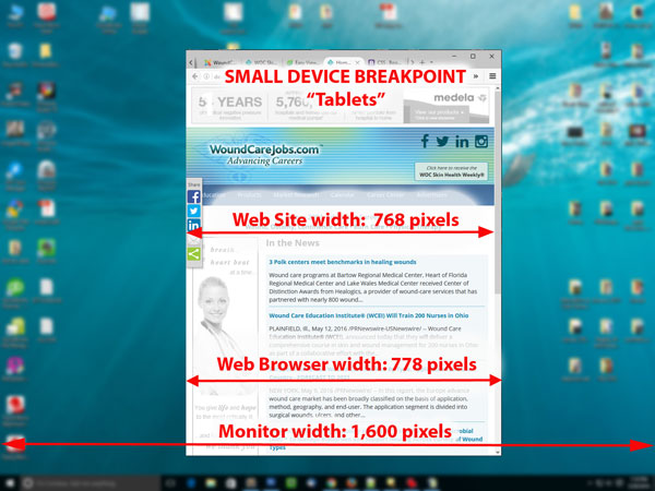
7.) Again, narrow the browser window and it will constrict to the small break point, which is commonly the "Tablet" size.
8.) Finally, the last extra small break point is for Mobile devices.

You can also look at this handy demo page showing how the Bootstrap Framework works using the steps just described above.
http://codepen.io/jstneg/full/xbGVLQ/
Additional Reading
There are built in tools in most browsers
Firefox: https://developer.mozilla.org/en-US/docs/Tools/Responsive_Design_Mode